My Wellbeing
Restructuring years of organisational complexity into support colleagues can find under pressure.
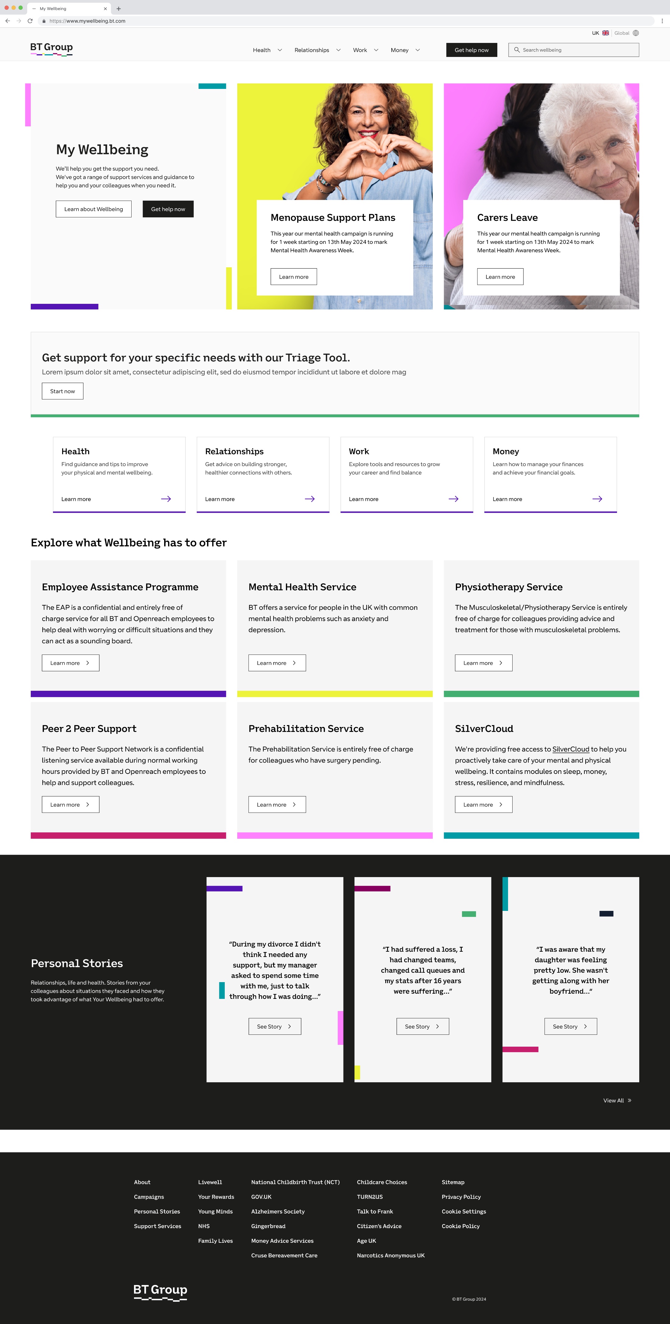
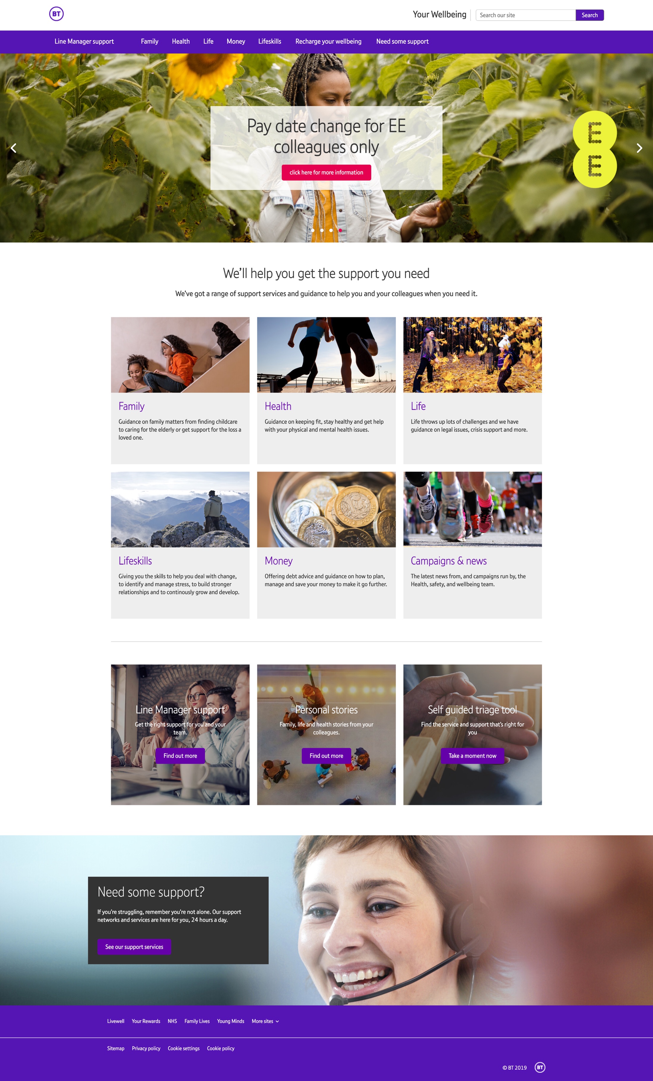
BT invests heavily in wellbeing support, mental health, financial, family and colleague services, but usage was low and awareness limited. Colleagues expected My Wellbeing to be a single destination and instead found fragmented experiences, unclear navigation and overlapping content. As the sole product designer, I rebuilt the information architecture around how people actually look for help.
Support existed. Finding it was the problem.
The service had grown for years without an organising structure. Content was inconsistent, journeys overlapped across systems, and navigation gave no sense of what sat where. Colleagues arriving at My Wellbeing expected one destination and met a collection of separate experiences.
The stakes were higher than a typical navigation problem: people often arrive at wellbeing support in vulnerable moments, a mental-health crisis, a bereavement, financial trouble. Every extra decision between them and the right service is a cost paid at the worst possible time.
The content was fine. The structure asked colleagues to think like the organisation.
The ecosystem was structured around services, programmes and internal ownership. Colleagues search by situation and need, worried about a colleague, struggling with money, and those two models never met.
Life sat beside Lifeskills; money support was split four ways. Before finding help, a colleague had to work out which internal category their problem belonged to.
That reframed the project: from improving menus to reducing the complexity colleagues have to hold, with a structure that mirrors how they think about their problems.
Untangling years of organisational complexity
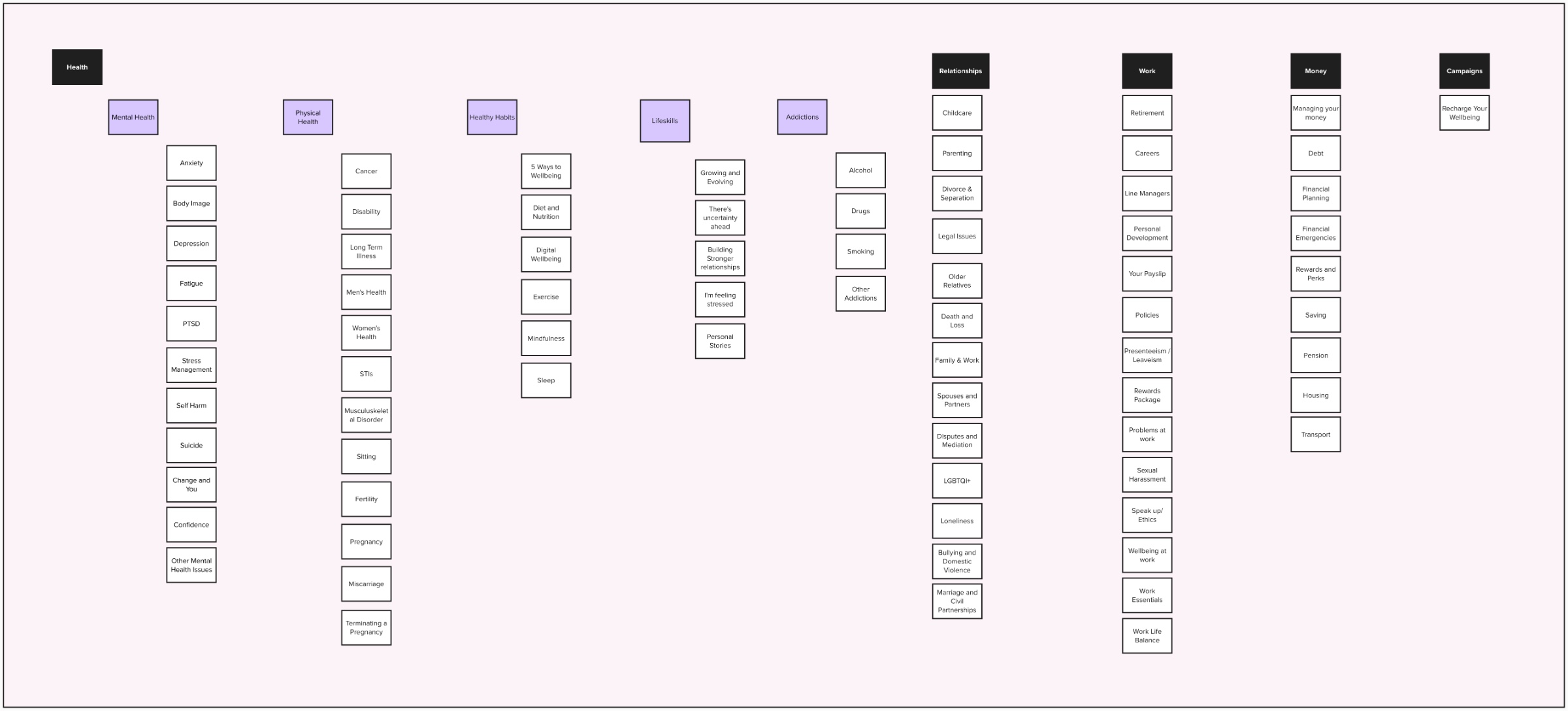
I audited the entire ecosystem and mapped every page and service, which made the overlaps impossible to ignore: duplicated journeys, competing categories, and pages with no single correct home. That map became the argument for a rebuild rather than a reshuffle.
From it I rebuilt the information architecture into four user-centred areas, Health, Work, Money and Relationships, replacing seven overlapping ones. It became the foundation for navigation, content patterns and every design decision that followed.
Aligning stakeholders around user needs
Confidence in design was low at the start, and feedback arrived as opinion, “it doesn’t feel engaging enough”. I used research evidence to move the conversation from taste to observed behaviour, and translated ambiguous reactions into specific, testable outcomes.
By the end, the wellbeing stakeholders were advocating for the design decisions themselves, the shift that made the restructure possible.
Designing a service that can be navigated under pressure
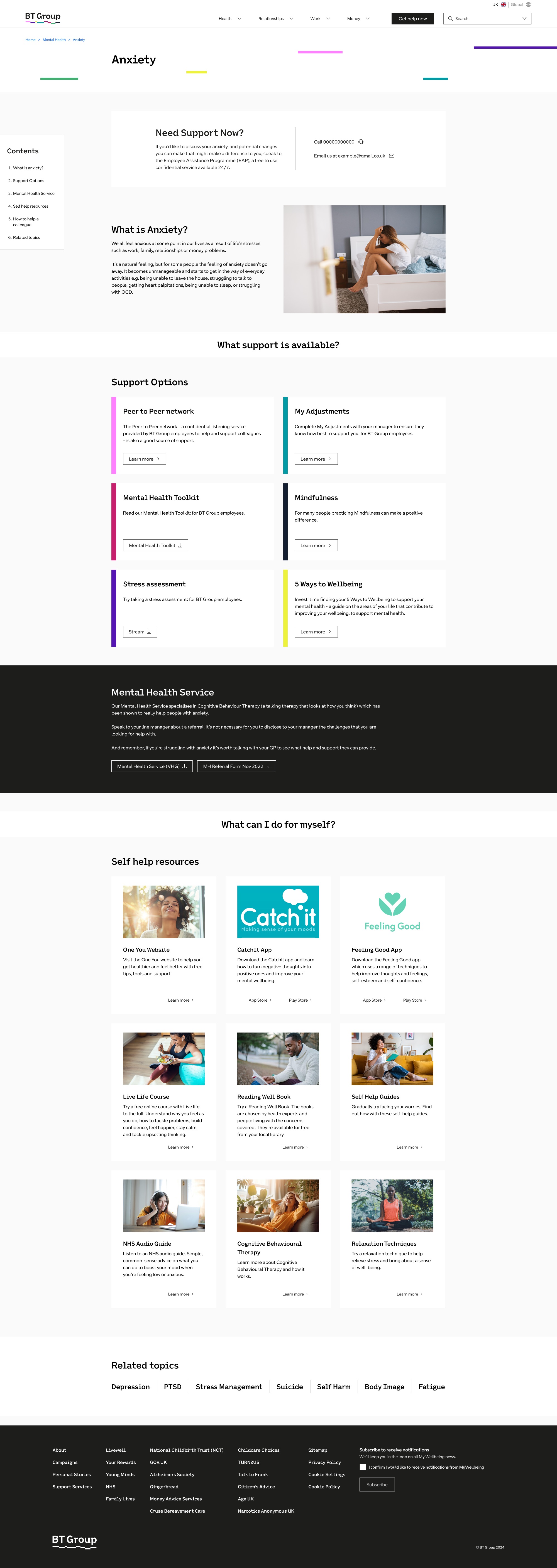
A mega-menu exposes the whole hierarchy at once, so colleagues can see the landscape instead of guessing at it. Critical support moved earlier in journeys, and content patterns now distinguish services, resources and guidance clearly.
The goal throughout: reach the right support path quickly, without needing to understand how BT is organised.
Fragmented resources, now a coherent service
+20% of participants reached the EAP contact number in a single click, from 0% being able to find it in 1 click.
Overlapping categories replaced by Health, Work, Money and Relationships.
Follow-up testing showed shorter click-paths to key support and less exploration effort.
Live across BT Group, with an evidence base in place for post-launch iteration.
The platform launched across BT Group, and follow-up usability testing showed what the restructure was for: colleagues reached key support in fewer steps and spent less effort exploring to find it.
The lasting outcome sits beneath the interface. A user-centred architecture now exists where none did, design, engineering and the wellbeing team share one understanding of the service, and decisions are trusted because they trace back to research rather than preference.